Google’s new logo
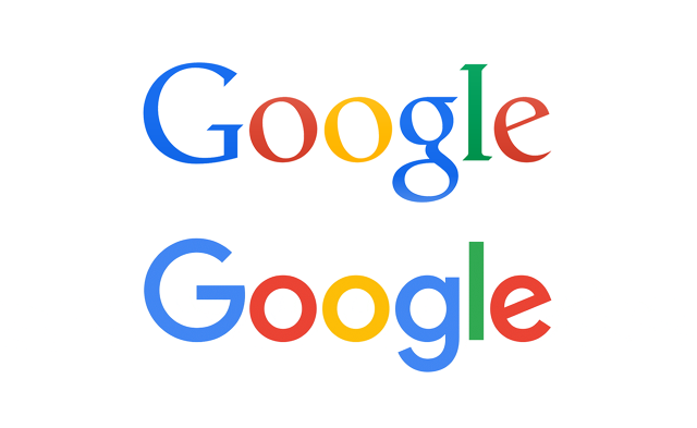
Google yesterday changed it’s logo after a long time with the main change being the typeface and the added animation. They’ve been using a serif wordmark since 1999 up until 2015, the only changes occurred in between were, the removal of drop shadow and letter spacing.
It’s updated now to a sans-serif typeface which itself is one of google’s creations, called Product sans. This typeface was first introduced with google’s new parent company, Alphabet, making their design language fall inline with one another.
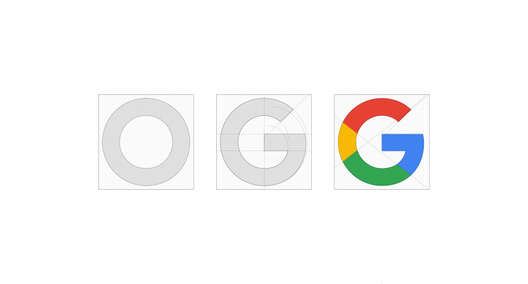
The new logo has pixel accuracy, perfect curves and trimmed out glyphs that increasest it’s readability on the smallest of screens. Google has simultaneously replaced the lowercase ‘g’ with an uppercase ‘G’ with all four of google’s main childlike basic colours.
This approach signifies a modern and progressive evolution to everyone who’s technological infrastructure is built by google.
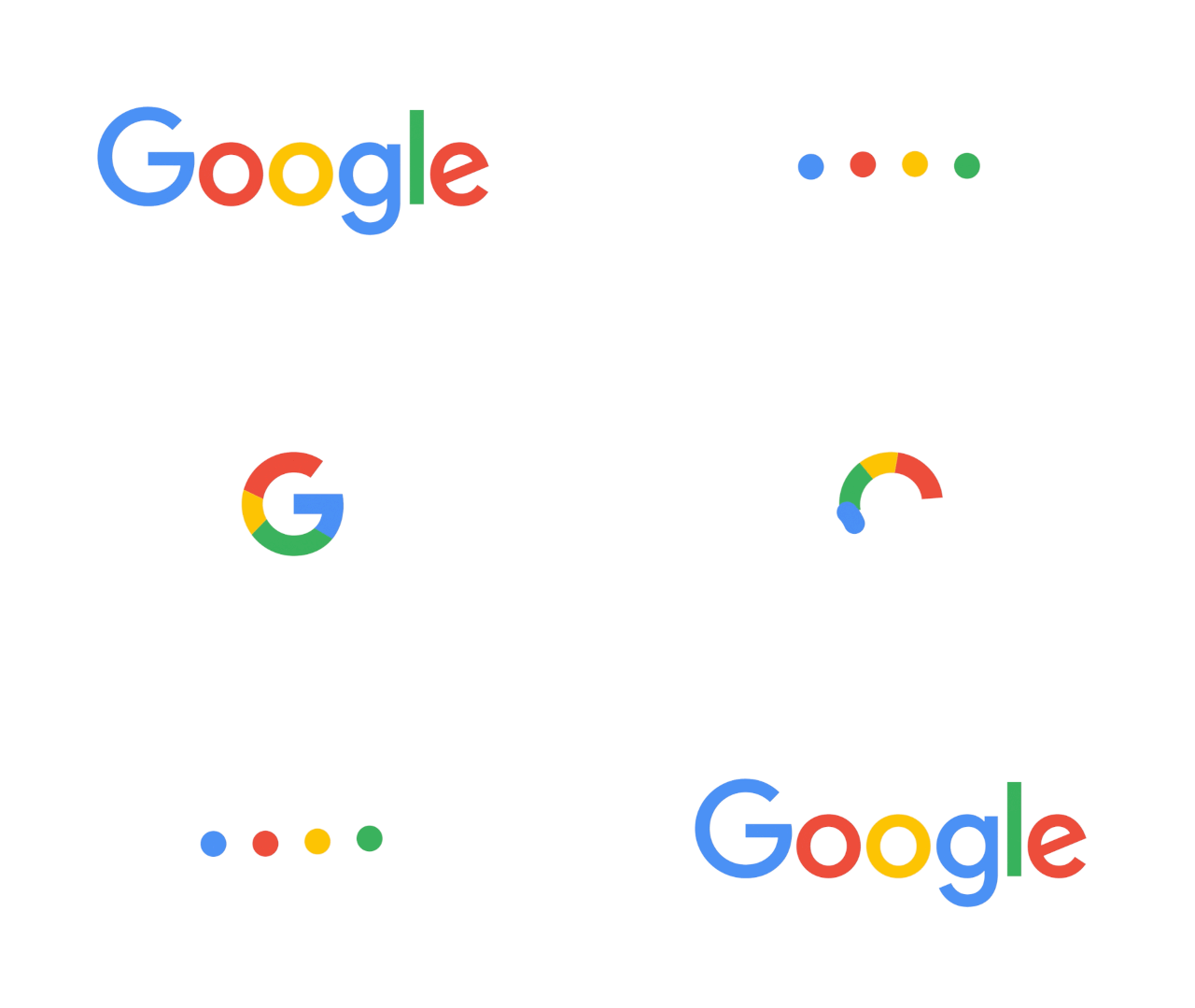
The more notable change, however, is the added animation. Unlike the rest of the world and their static logos, google’s logo transforms into a series of four dots that orbit in a circle and await your request, which is possible only on screens.All in all, google’s new logo is personalised, flexible, neat and absolutely note worthy.
Written by,
Arushi Arora
Graphic Designer
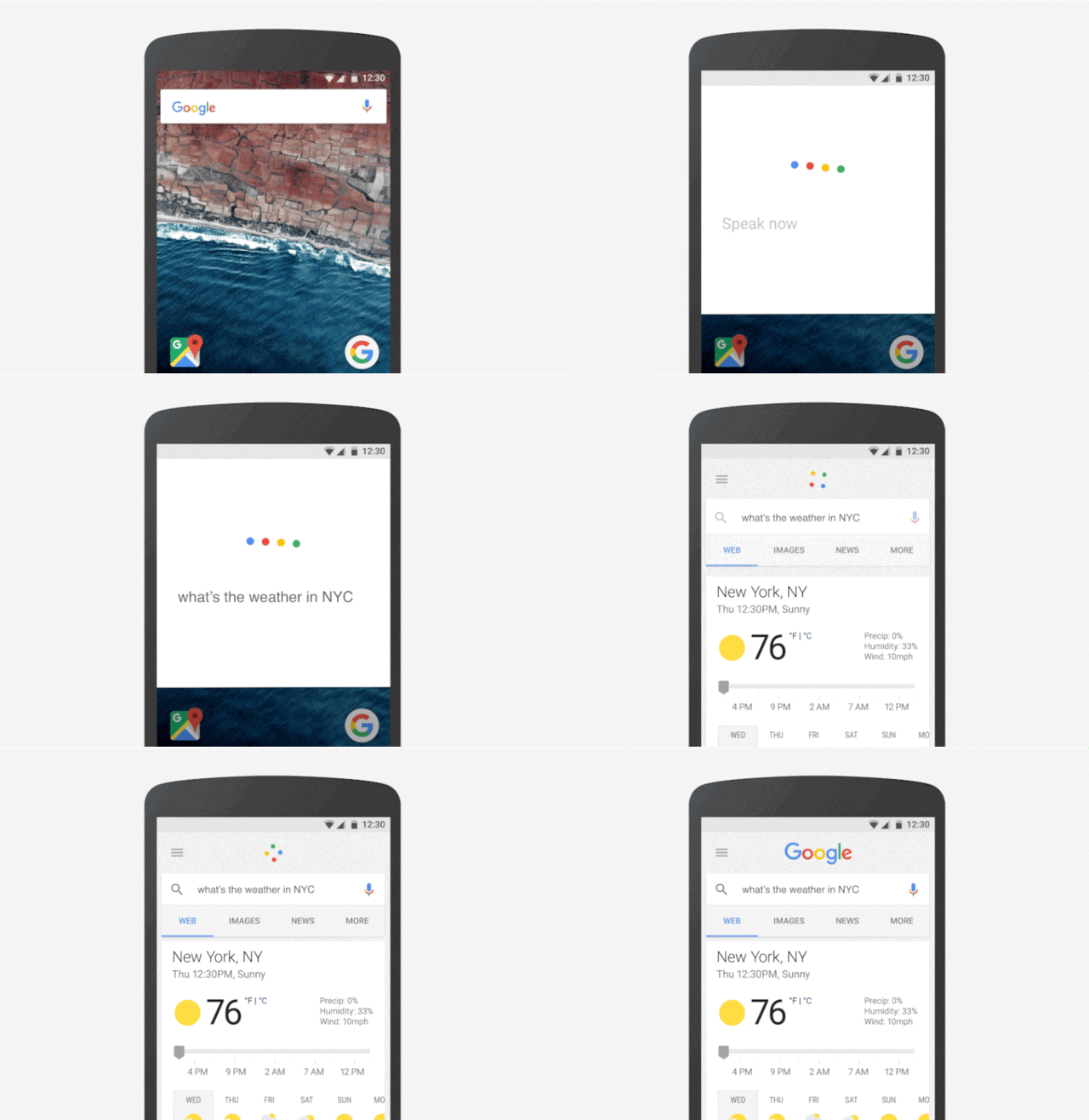
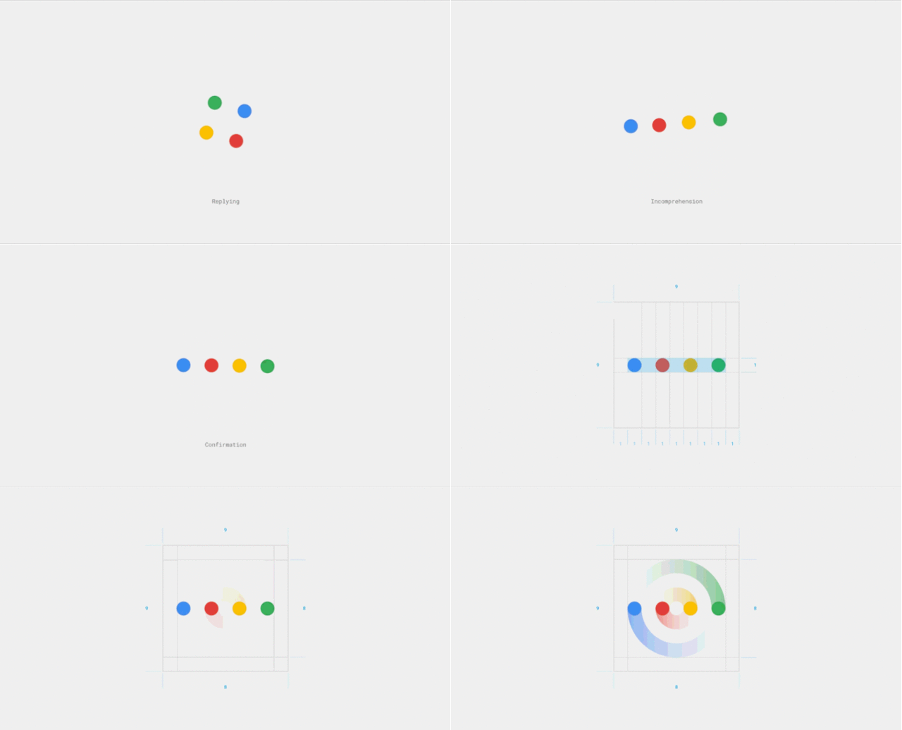

above used gifs are credited to fastcodesign.com


